Company Overview
Williams Insurance represents the culmination of four generations in the insurance business. Beginning with Claris Williams in the 1940's who sold insurance as a sideline. Carl Williams began the business as it is today. Jim Williams led the company in recent decades and finally Mike has taken the helm to lead Williams Insurance into the future. Through a legacy of hard work and integrity, Williams Insurance has served its clients with great dedication. Long-standing relationships, sometimes spanning generations, create a history with clients, adding a level of familiarity and security.
Mike Williams shared with us some of the family values that continue to drive the business even today:
- Be honest and have integrity. This family-owned business carries a strong sense of pride and responsibility.
- Listen to your clients. Insurance is about protecting the unknown, and customer needs are paramount in building a relationship.
- Check your ego at the door. Service is about going that extra mile.
Projects
Branding
The History
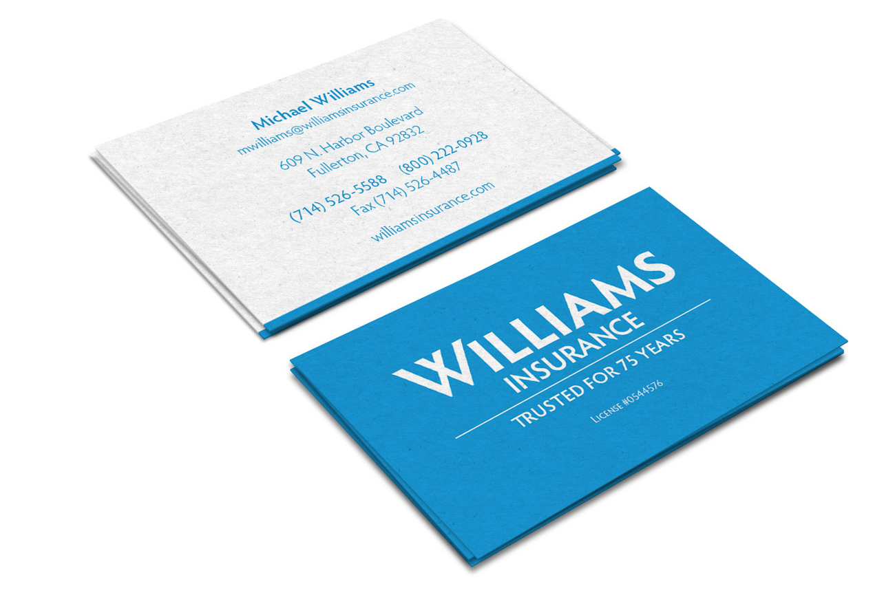
As a fourth-generation family-owned business with 75 years of history, the rebranded logo for Williams Insurance will represent the company's past as well as a glimpse into the future.
With a combination of typography, color, and hierarchy, the updated Williams Insurance logo has the ability to stand on its own now and for many years to come.
Original Logo Design
Industry Analysis
Logotype and Color
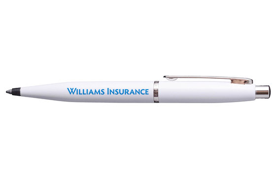
In our research, the most common colors for insurance companies are bright blues. The Williams color, PMS 2925, is bright and bold, while invoking a feeling of safety and confidence—which the company is known for.

Dark Blues and Greys
Bright Blues
Blues and Reds
Reds
Font Selection
Exploration & Refinement
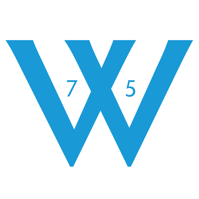
The logotype is based on a modified version of Hypatia Sans Pro; and it achieves the goals of expressing the strength and structure of a geometric sans serif that reflects the trust and legacy of Williams—while the humanist undertones support the approachable, customer service focus of Williams.
The logo includes uppercase letters and small caps that are clear and readable at both large and small sizes—while being easily recognizable. The distinct W letter of Williams emphasizes the stability of Williams Insurance rooted in 75 years of experience.
Typeface Exploration
Case Combinations
Character Modifications
Character Modifications
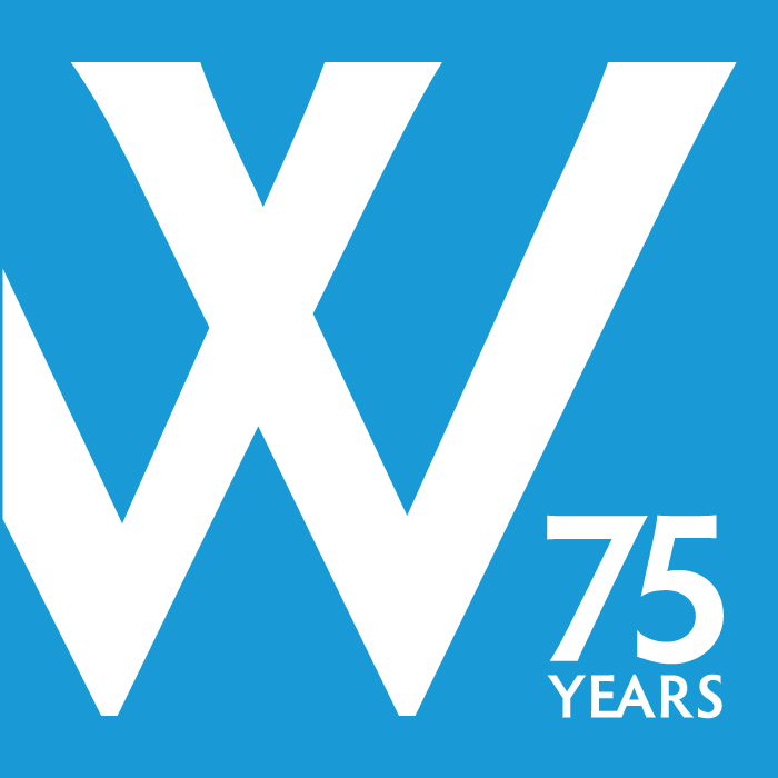
Alternates
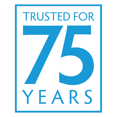
Alternate 75th Anniversary Badges
Branding Use Cases
Presentation Mockups
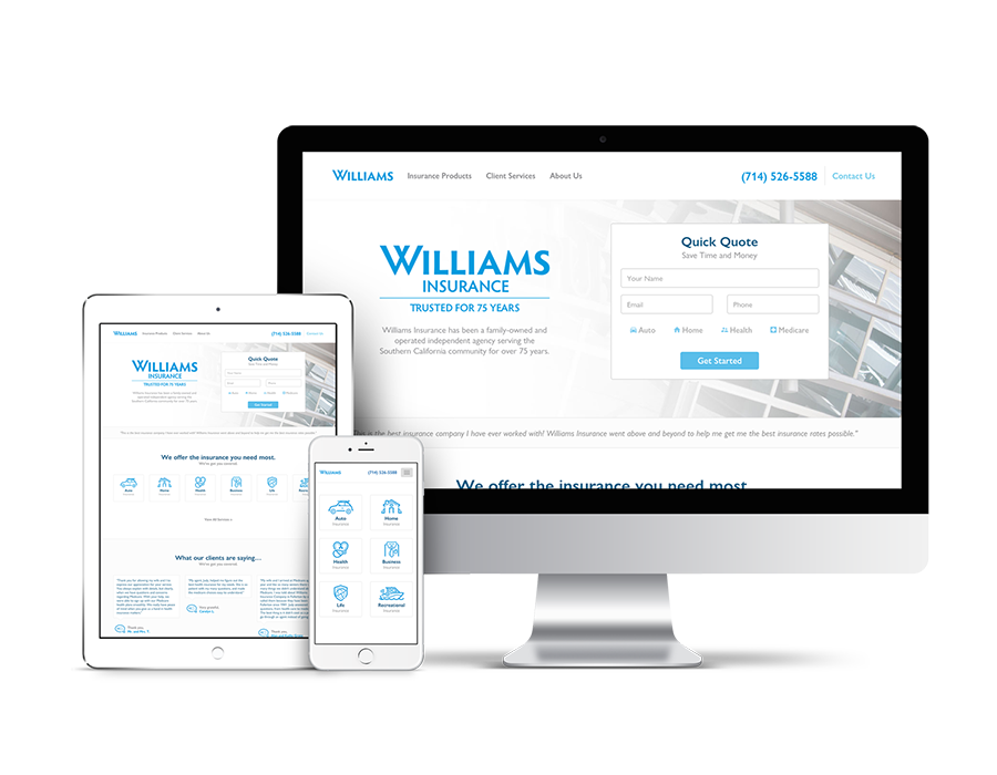
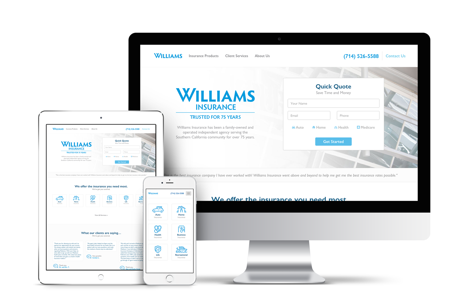
Responsive Website
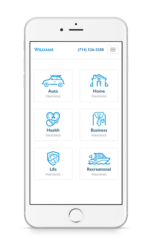
Website Redesign
The focus of the Williams Insurance website has always been to get potential clients in touch with a Williams Insurance team member as quickly as possible. The redesign of their site focused on gathering and capturing leads efficiently, and making it clear how and where to contact a Williams Insurance team member. An industry study was performed to observe how leading insurance companies offered and gathered services to potential clients.
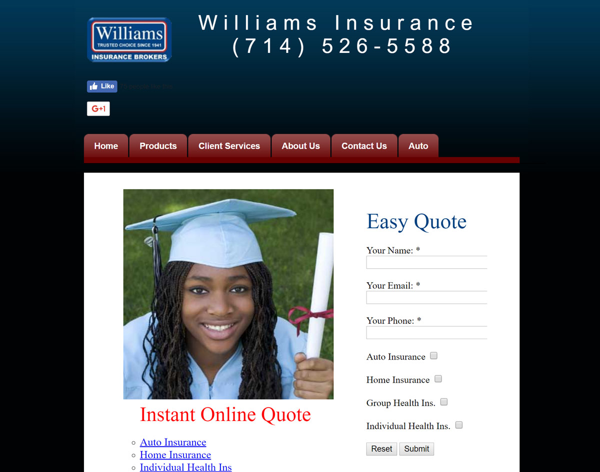
Original Static Site
Industry Analysis
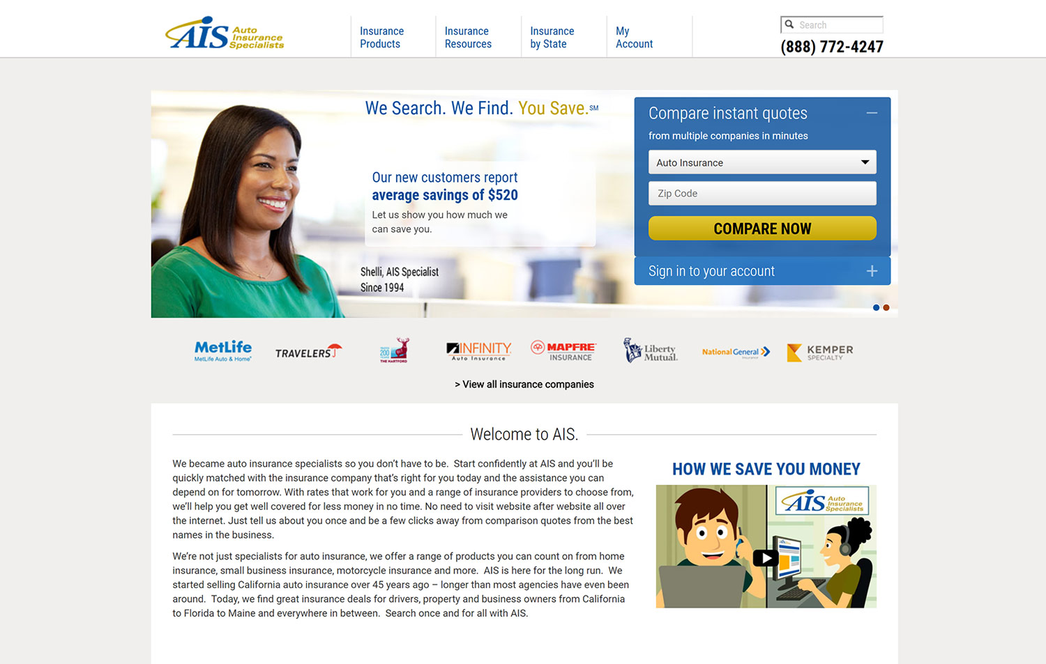
AIS
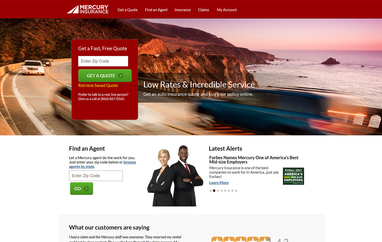
Mercury
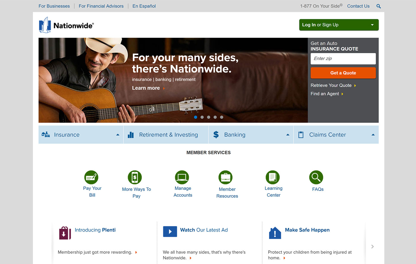
Nationwide
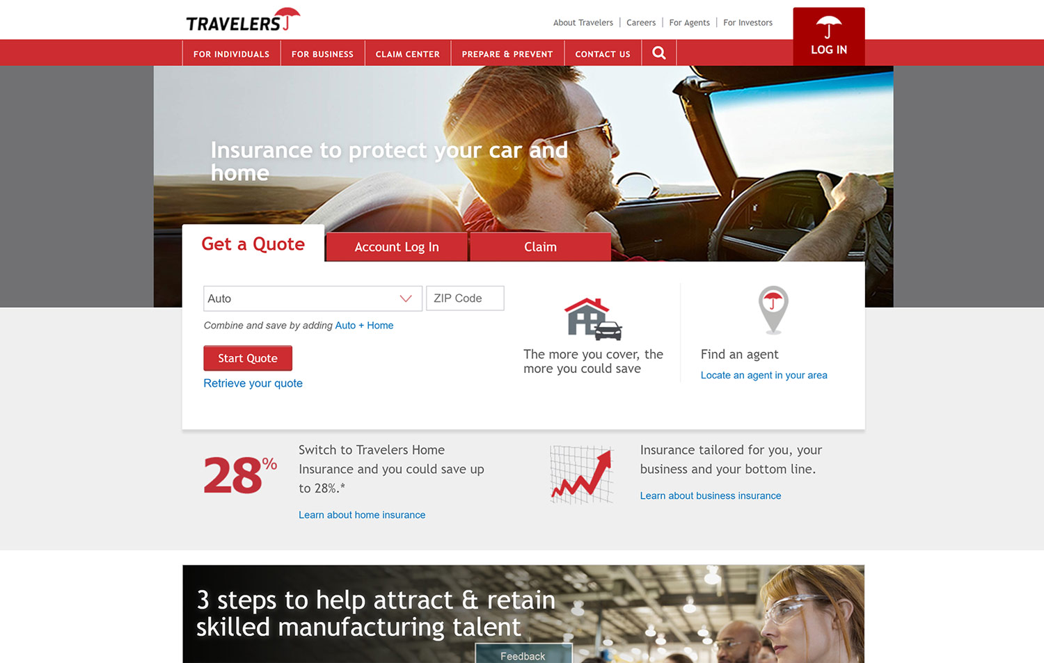
Travelers
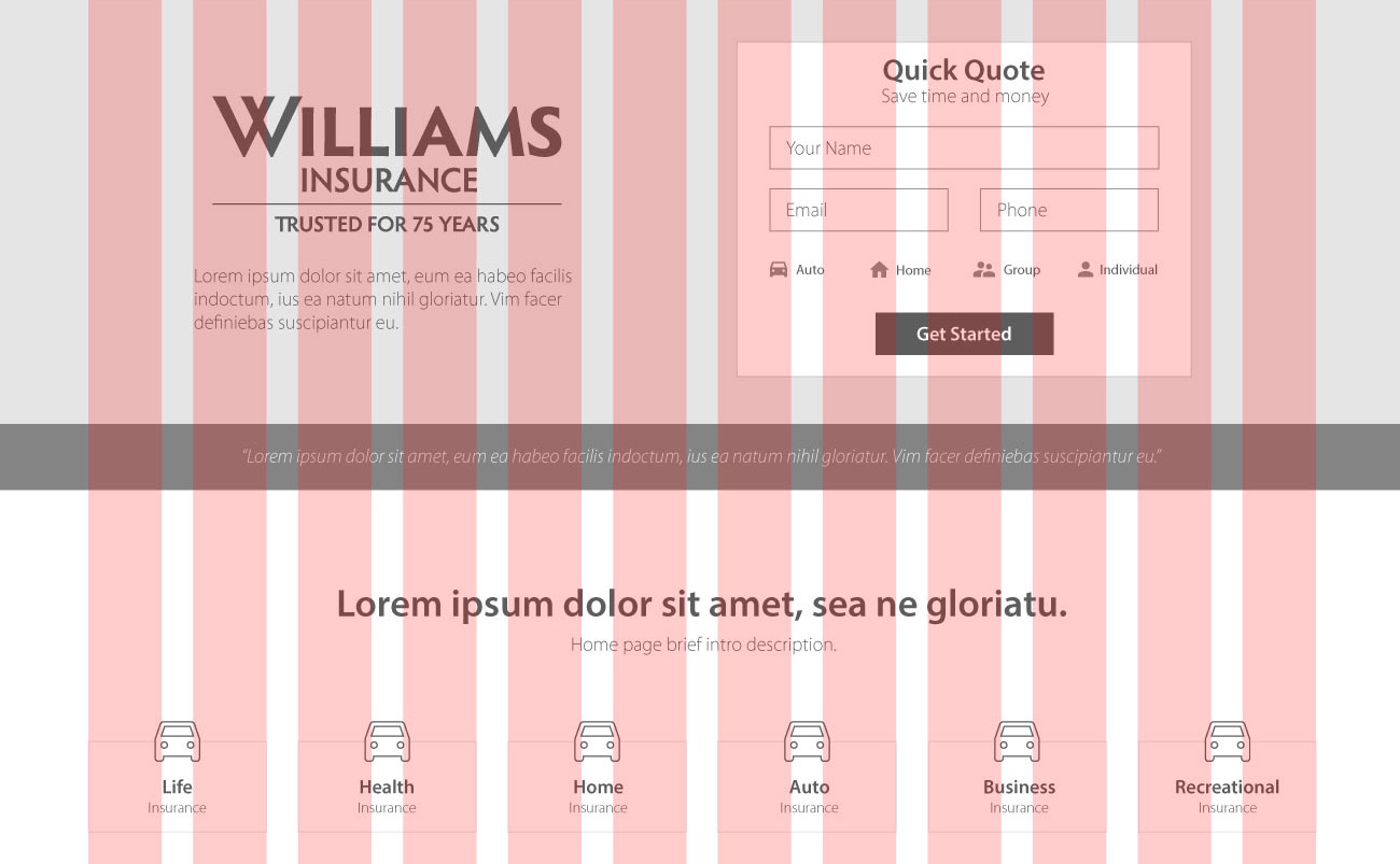
From Sketch to Color
Grid & Layout
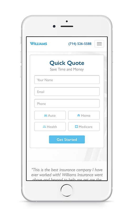
The site was designed with a communication first approach. A simple form was added to the initial landing page along with the phone number and a call to action clearly visible on all device types, followed by a list of services offered and a brief description of the company and its team members. Since Williams Insurance is a family owned business displaying an immediate sense of trust was very important.
The scope and hierarchy was mapped out first in pen and refined through several iterations digitally before finally converted to a web format for testing on multiple device types.
Basic Grid
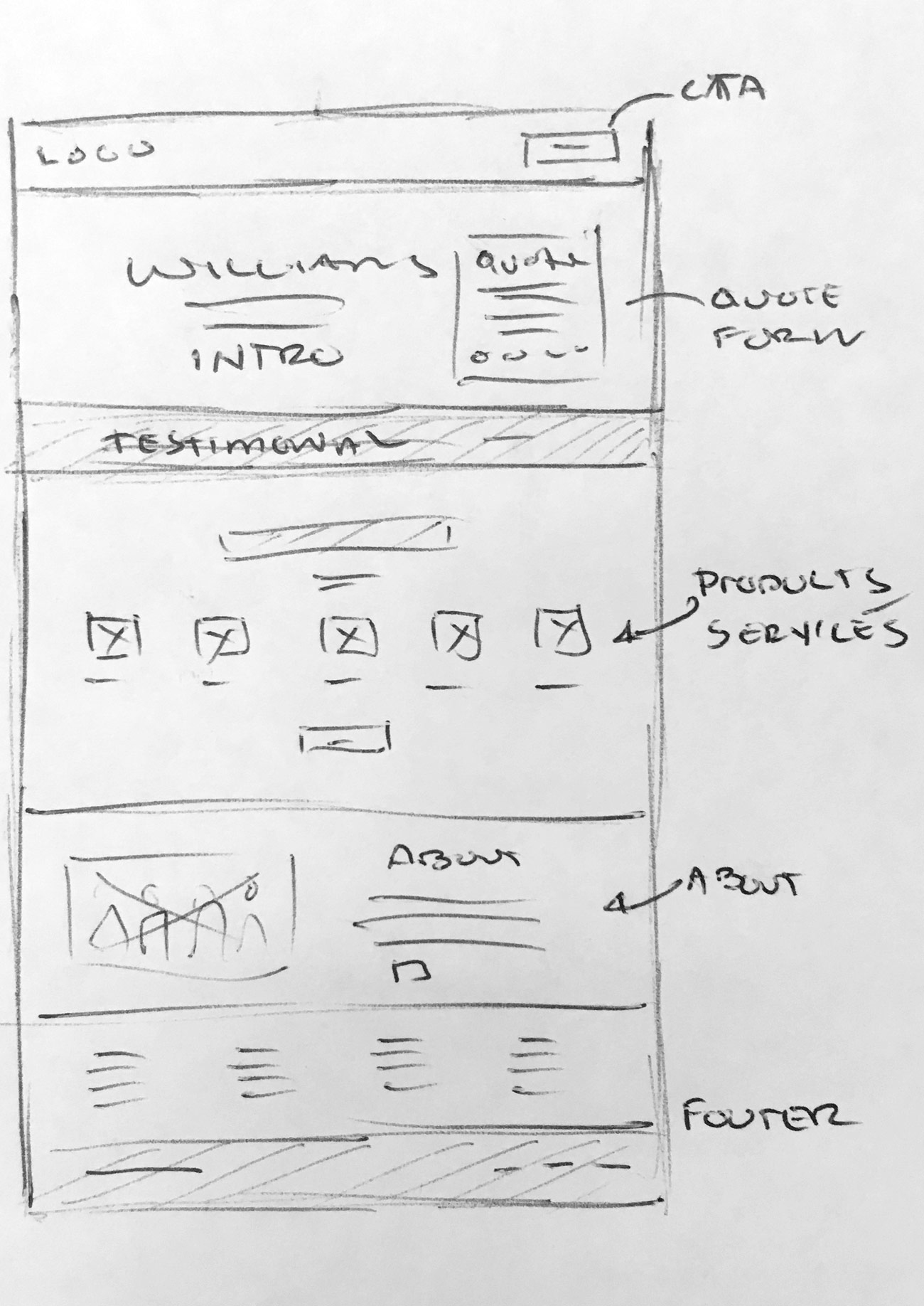
Rough Sketch
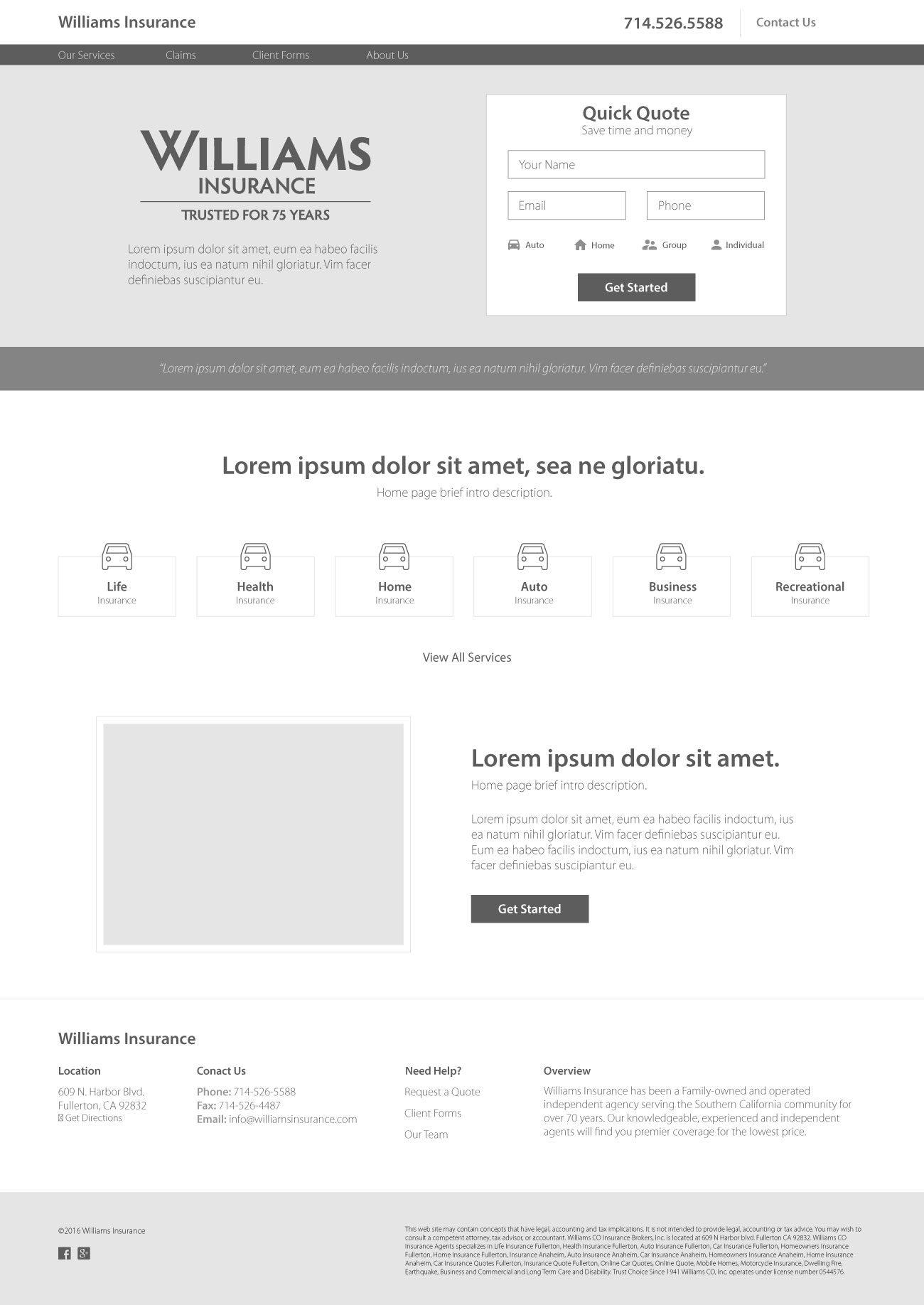
Greyscale Wireframe
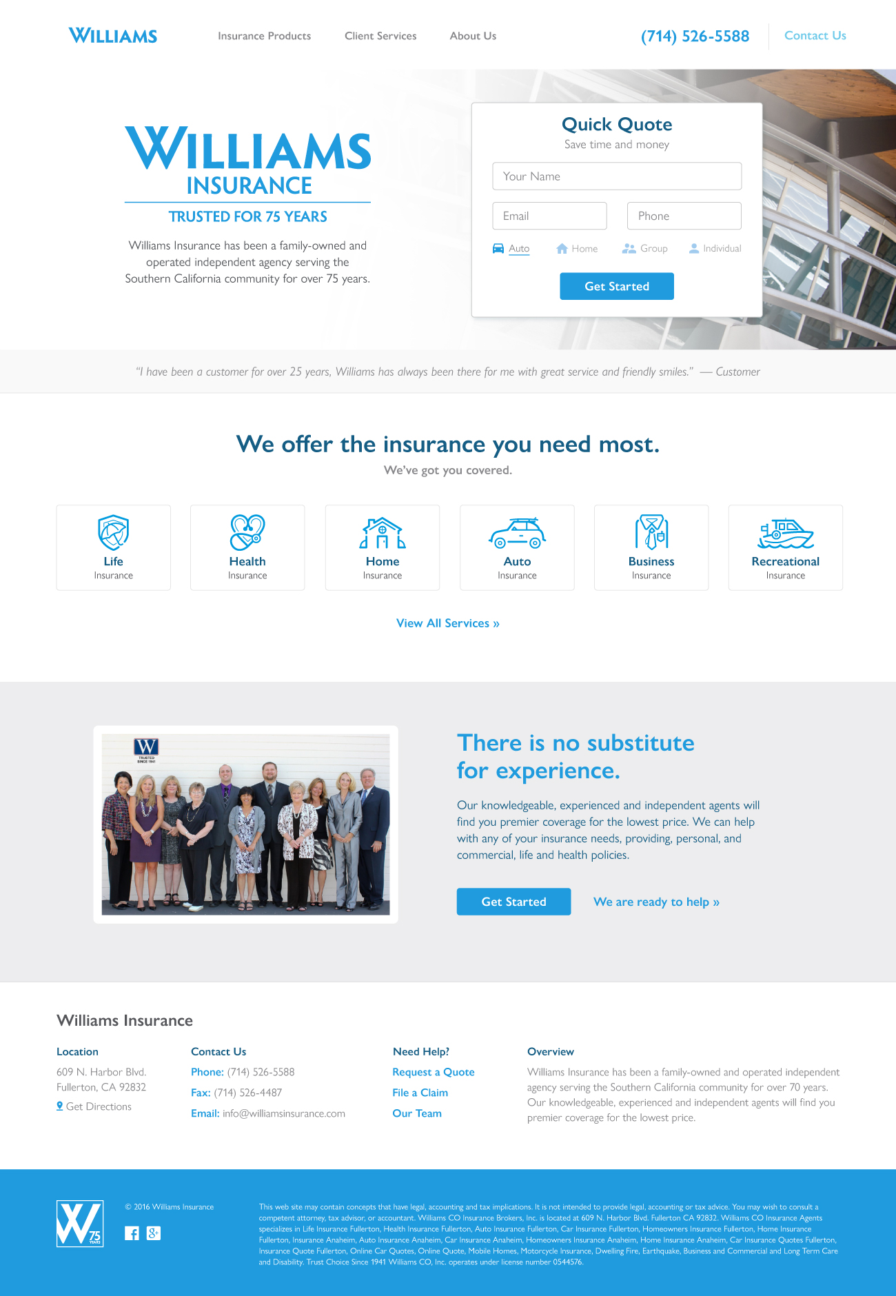
Color Comp
Mobile Support
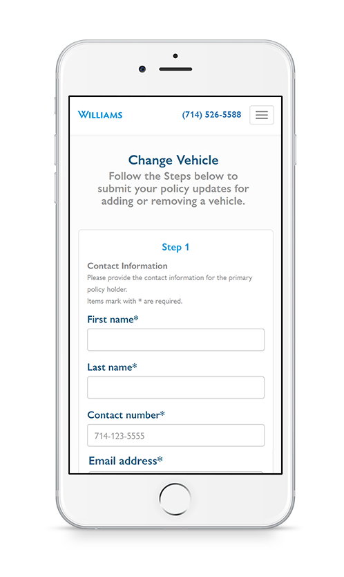
Simplifying Complex Interactions
Create a clear path for users to accomplish a task quickly and efficiently.